All For The Boards
A bold, modern charcuterie brand bringing curated grazing boards to the table—served with a side of color, confidence, and unapologetic flavor. With names like Trust Fund Taste and Death to Sad Snacks, they’ve built a brand that’s anything but boring.
Overview
A Brand With Bite
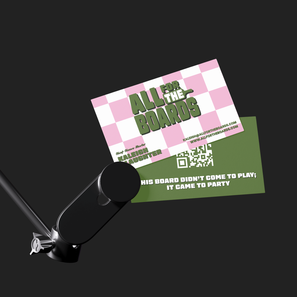
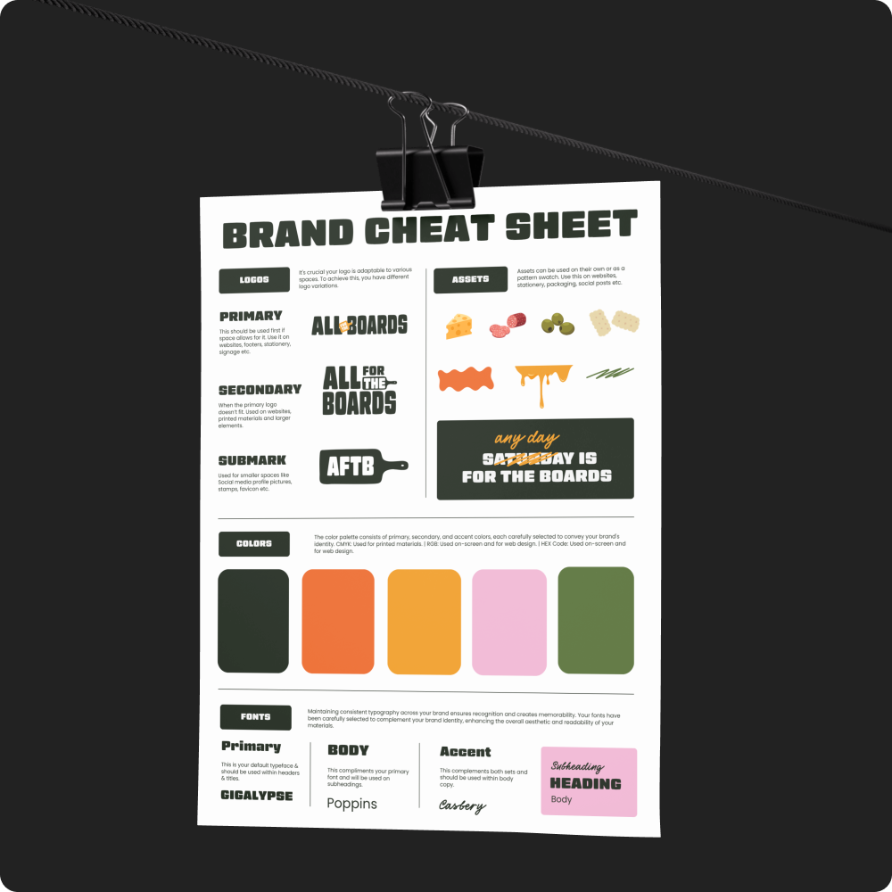
All For The Boards came to us with a vision: bold, elevated charcuterie that doesn’t play it safe. We built their brand from scratch—starting with the name, then crafting a full identity system with punchy language, modern design, and art-directed visuals. From the citrusy color palette to the confident tone (“Boring called—we didn’t answer”), everything was designed to feel fresh, cheeky, and scroll-stopping.
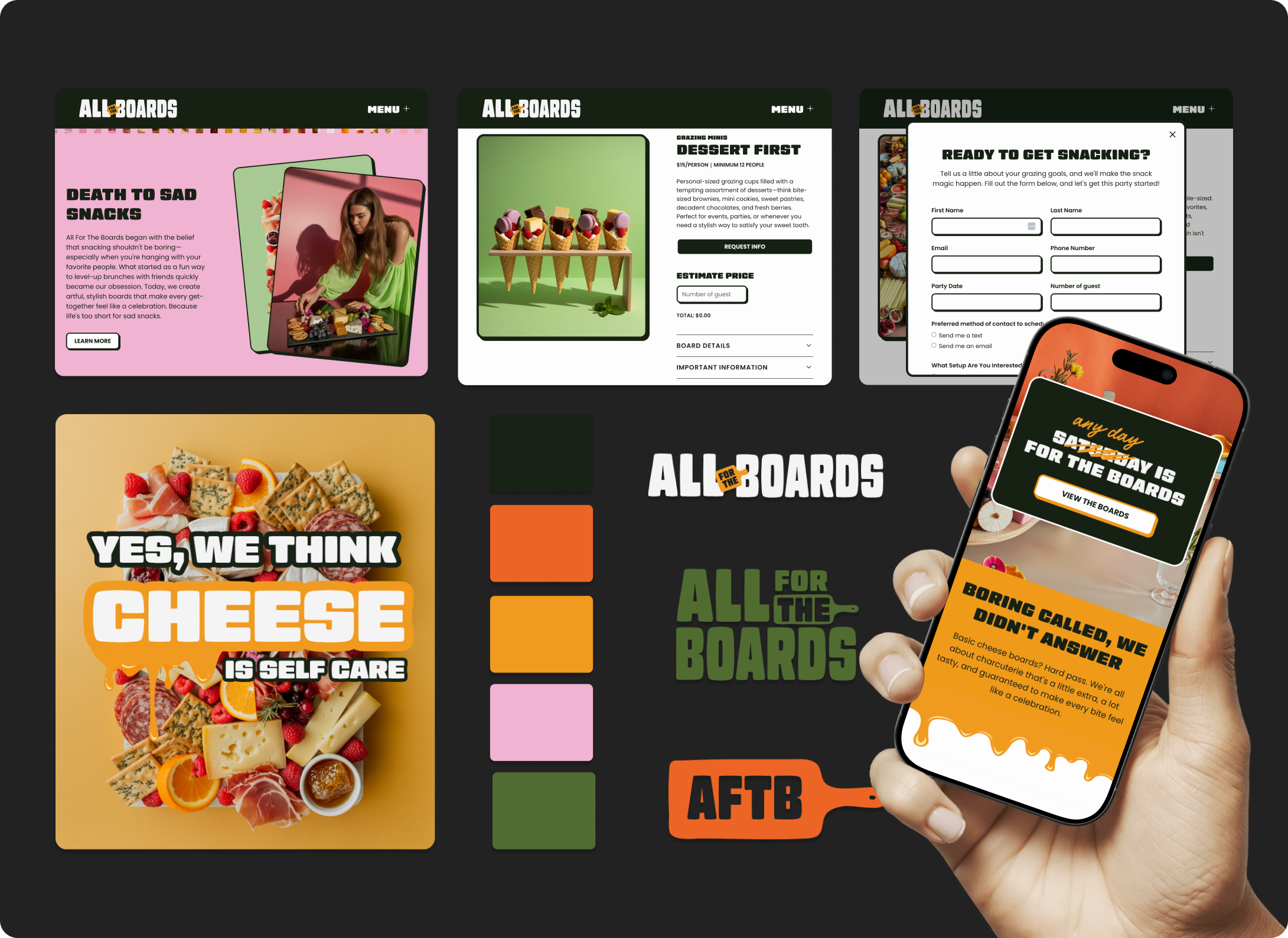

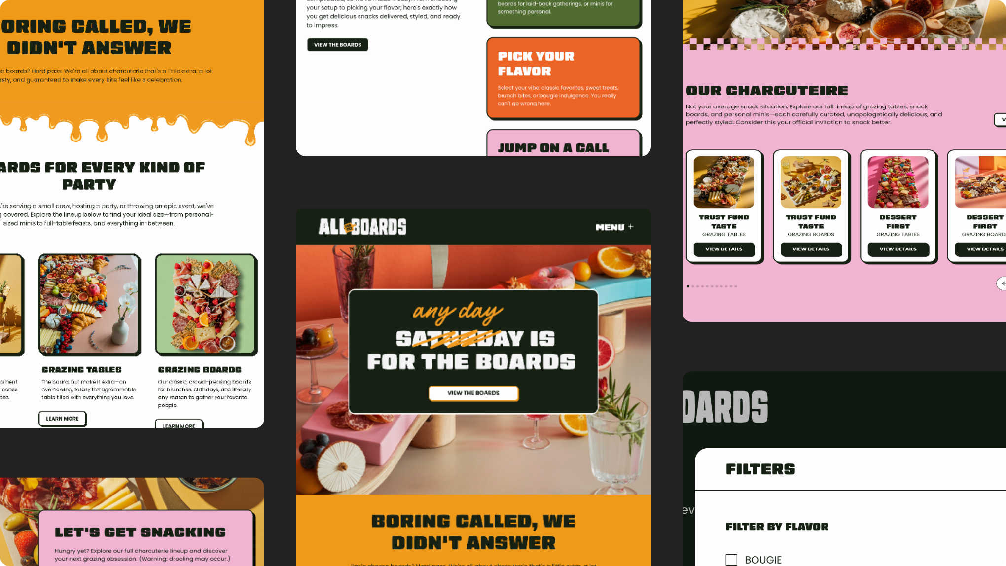
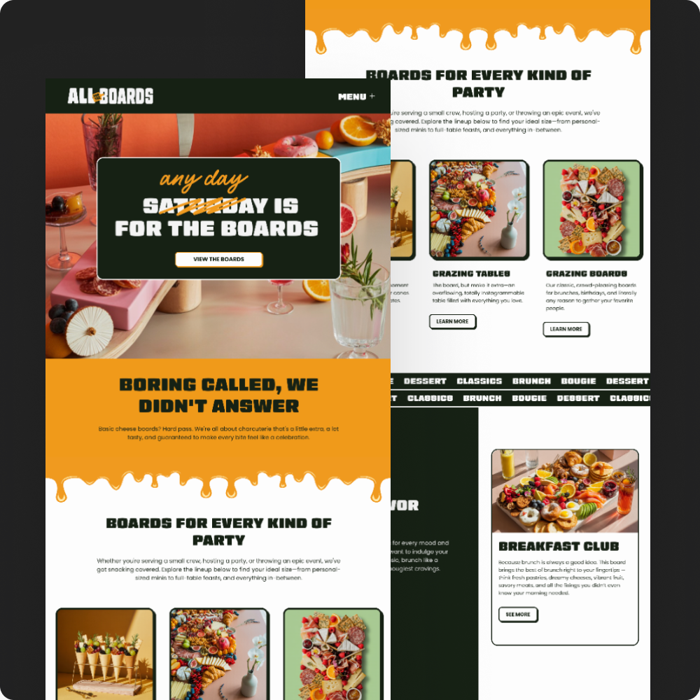
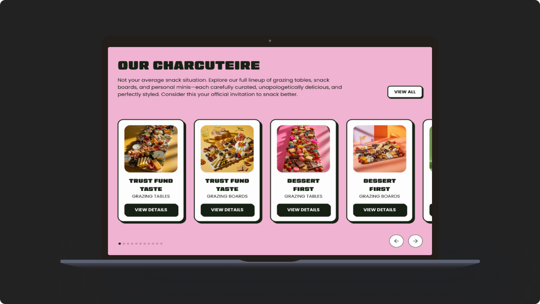
A Website That Feeds Curiosity
We designed a Webflow site that’s just as functional as it is fun. Full-bleed visuals, interactive board filtering, and a live pricing calculator make the experience effortless for customers and event planners alike. Subtle GSAP animations and a smooth mobile layout round out a site that feels polished without losing personality.

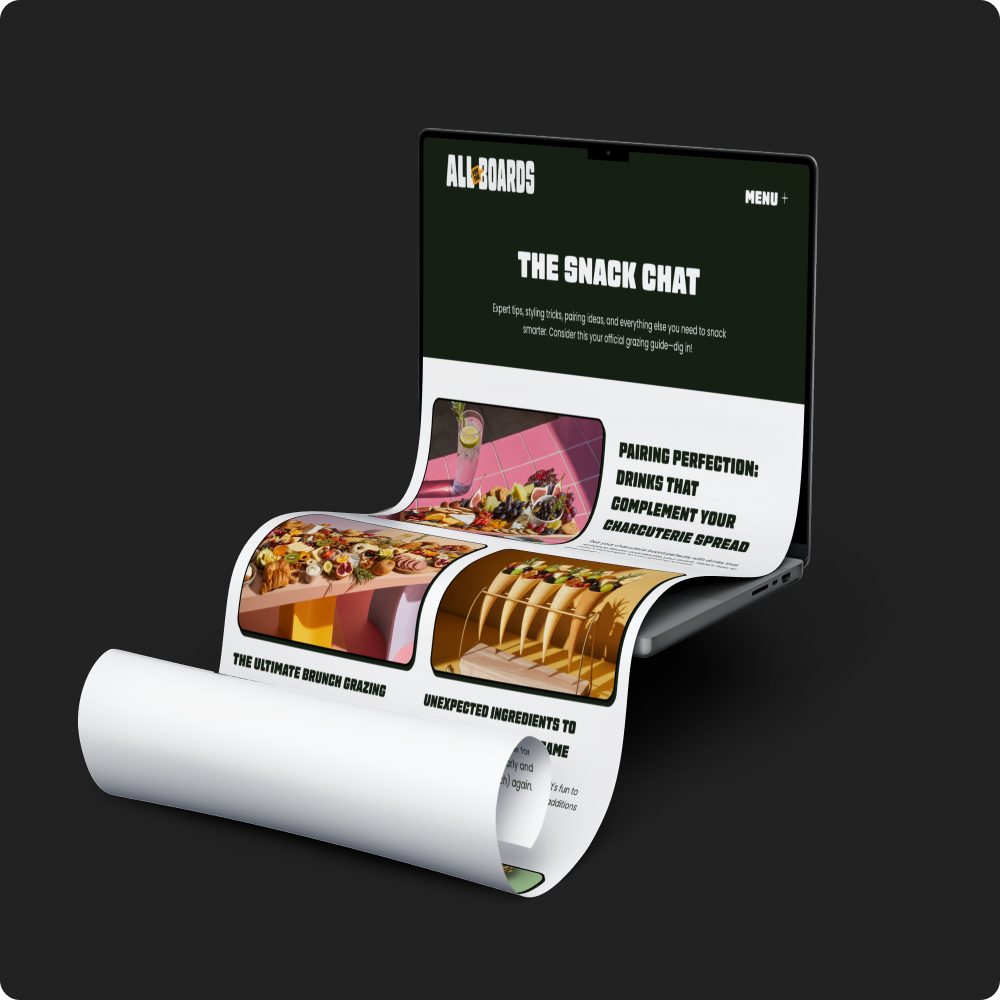
Searchable, Shareable, Snackable
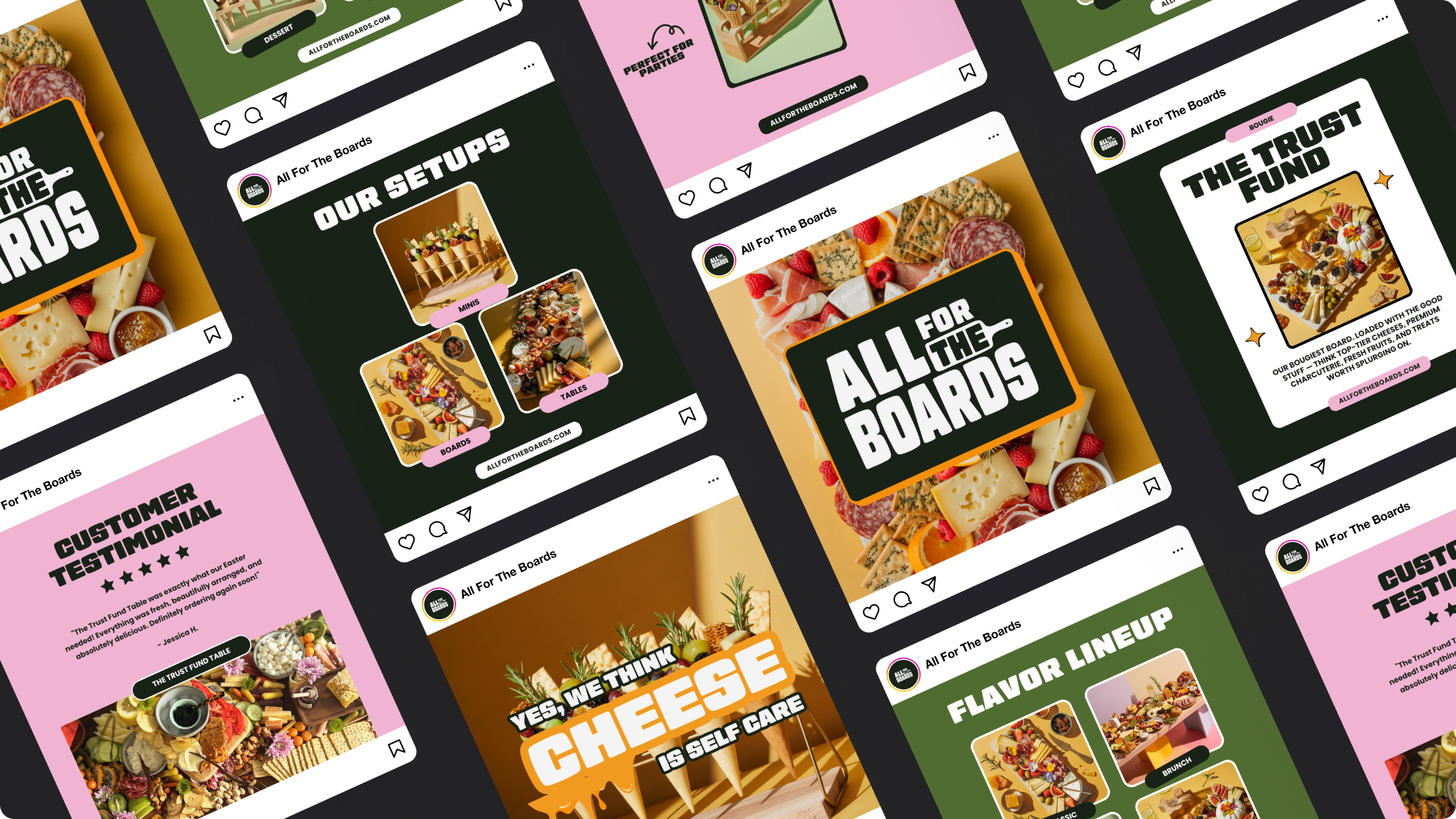
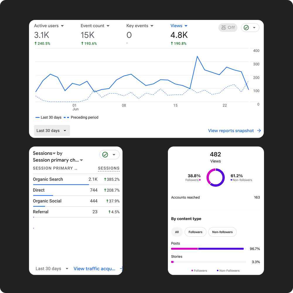
From foundational SEO to social-ready content, we set the brand up to be found and followed. We optimized site structure and metadata, launched a blog strategy through “The Snack Chat,” and created reusable social templates to boost seasonal visibility. It’s a full-stack system designed to support both discovery and delight.
Thank you
Have an idea?
We'd love to hear from you!