PorchLight Stays
PorchLight Stays is a curated short-term rental brand designed to welcome guests home—whether at the beach or in the mountains. Built to unify a collection of beautiful properties across very different markets, the brand offers guests the comfort of a familiar, trusted name no matter where they travel. We created the full brand identity from the ground up, centered on warmth, recognition, and long-term scalability.
Overview
A Brand That Feels Like Home
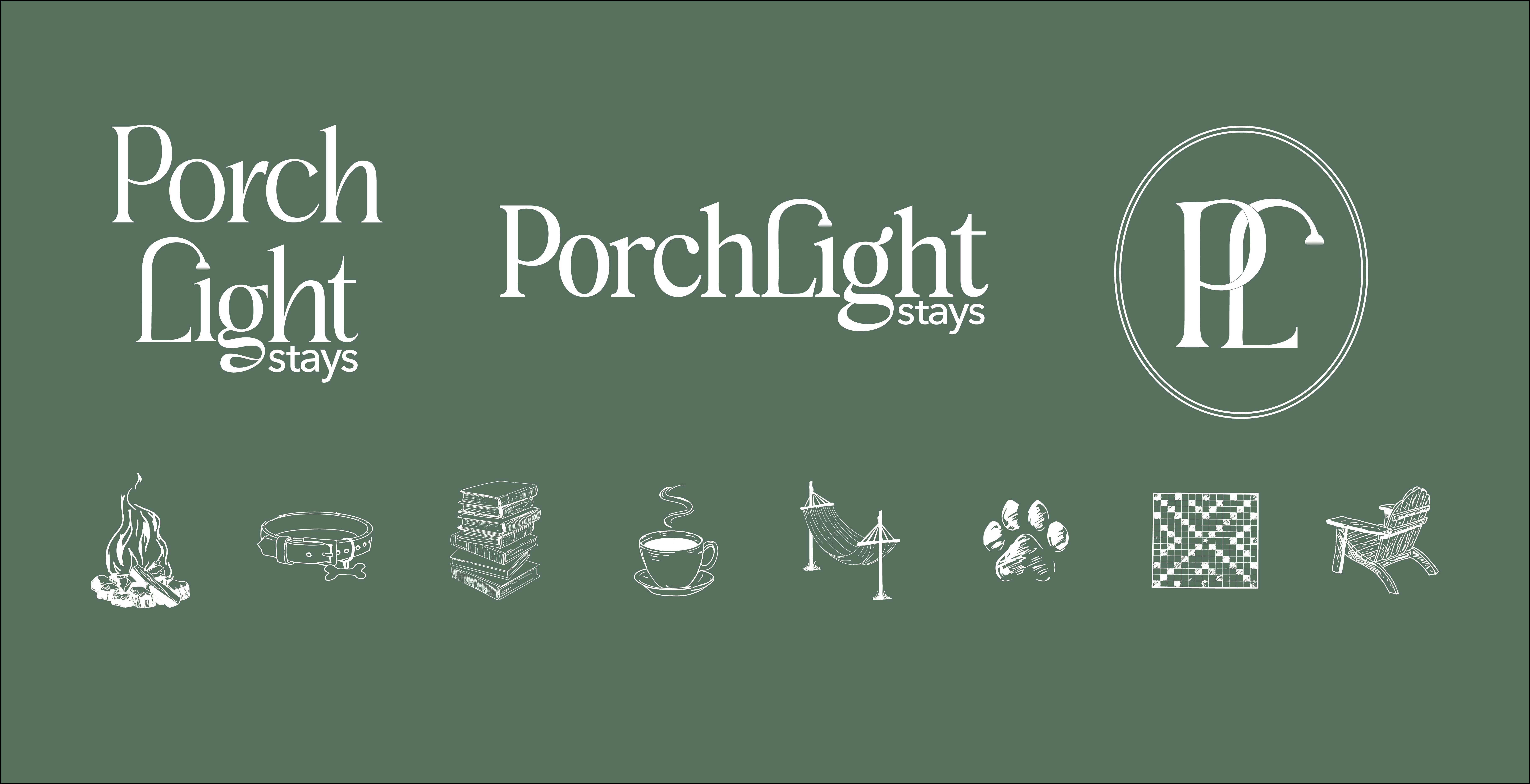
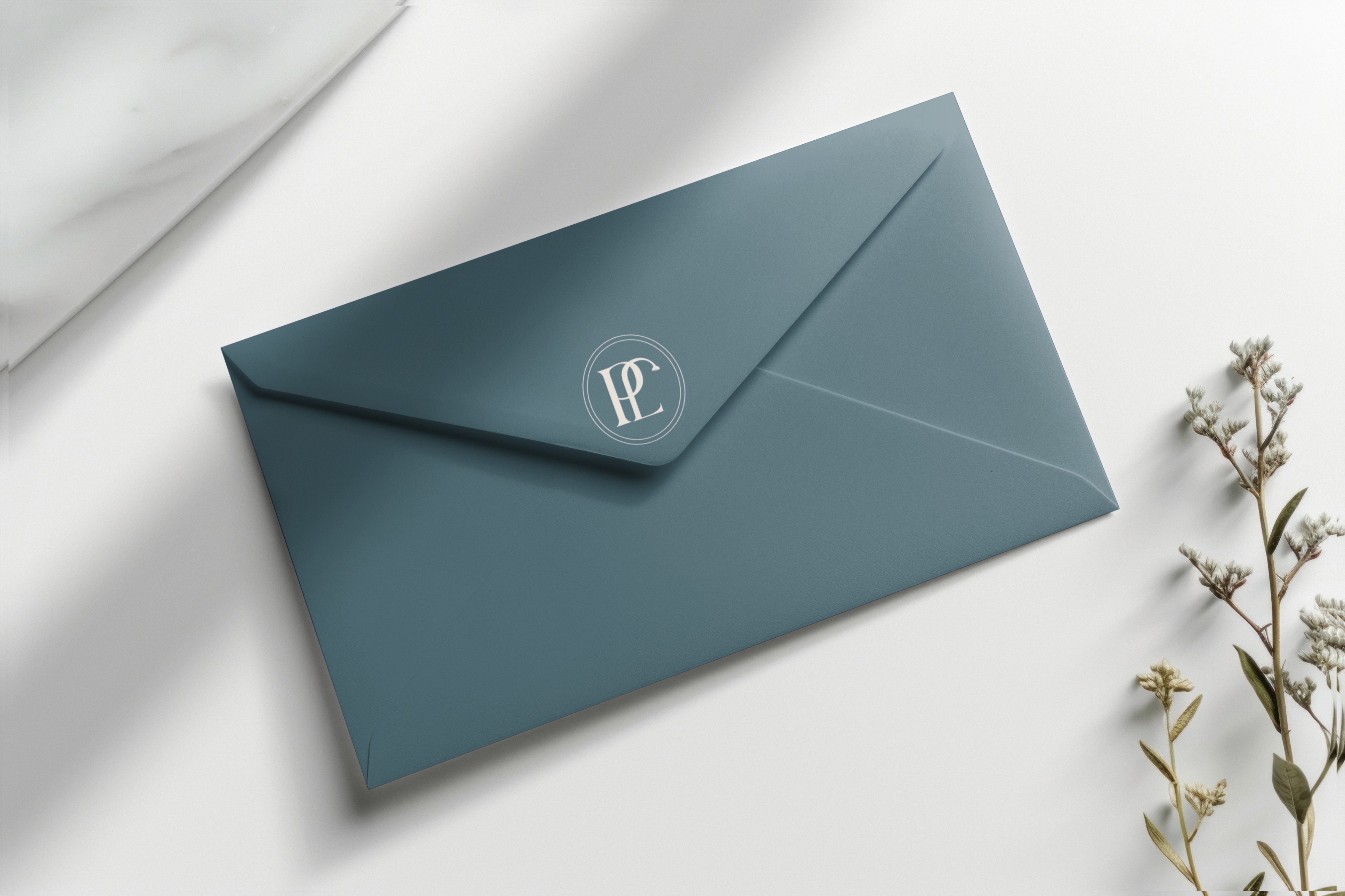
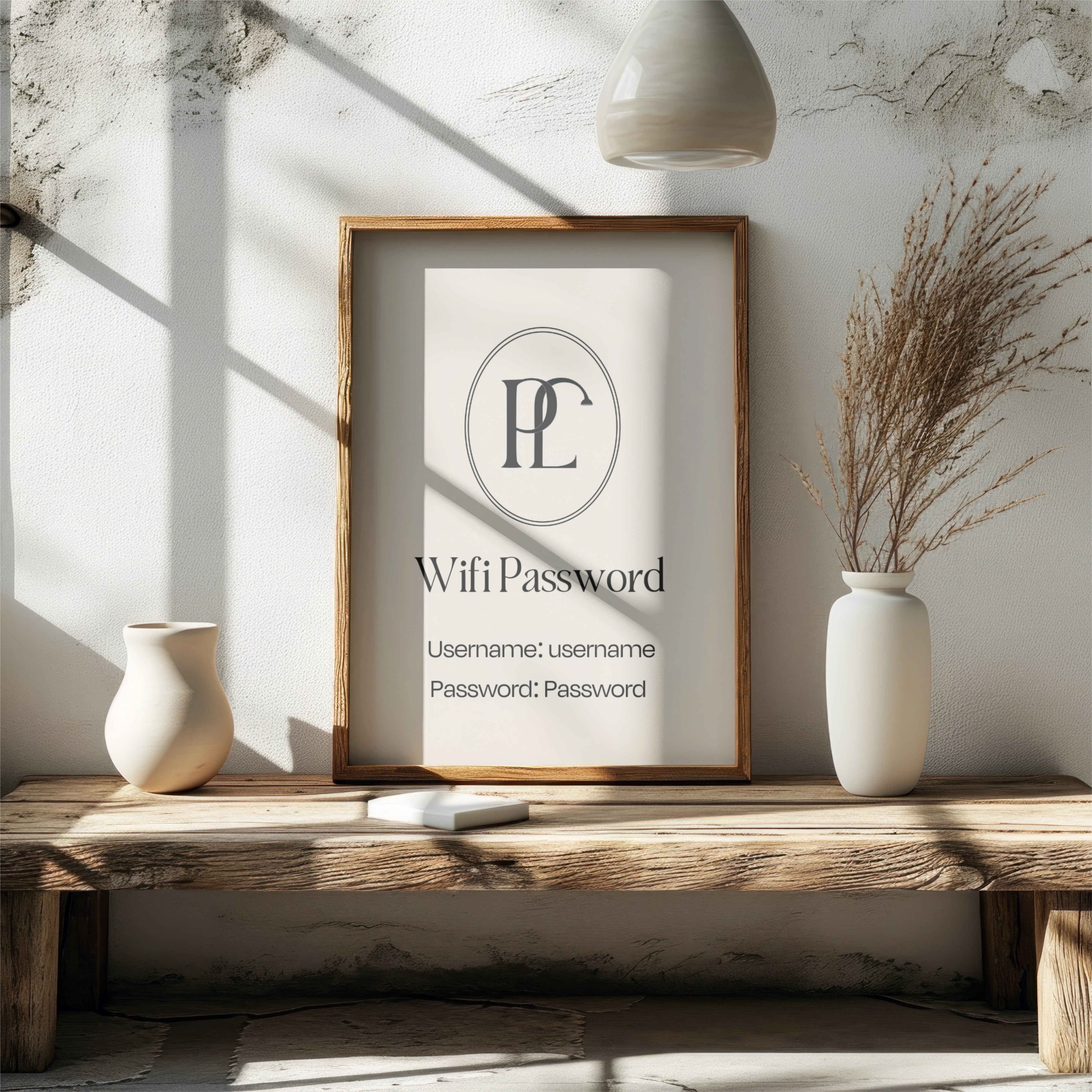
The visual identity for PorchLight Stays was crafted to feel warm, editorial, and quietly confident—something guests would recognize and trust across locations. The logo system is anchored by a custom serif wordmark with subtle personality, nodding to vintage hospitality signage while remaining clean and modern.
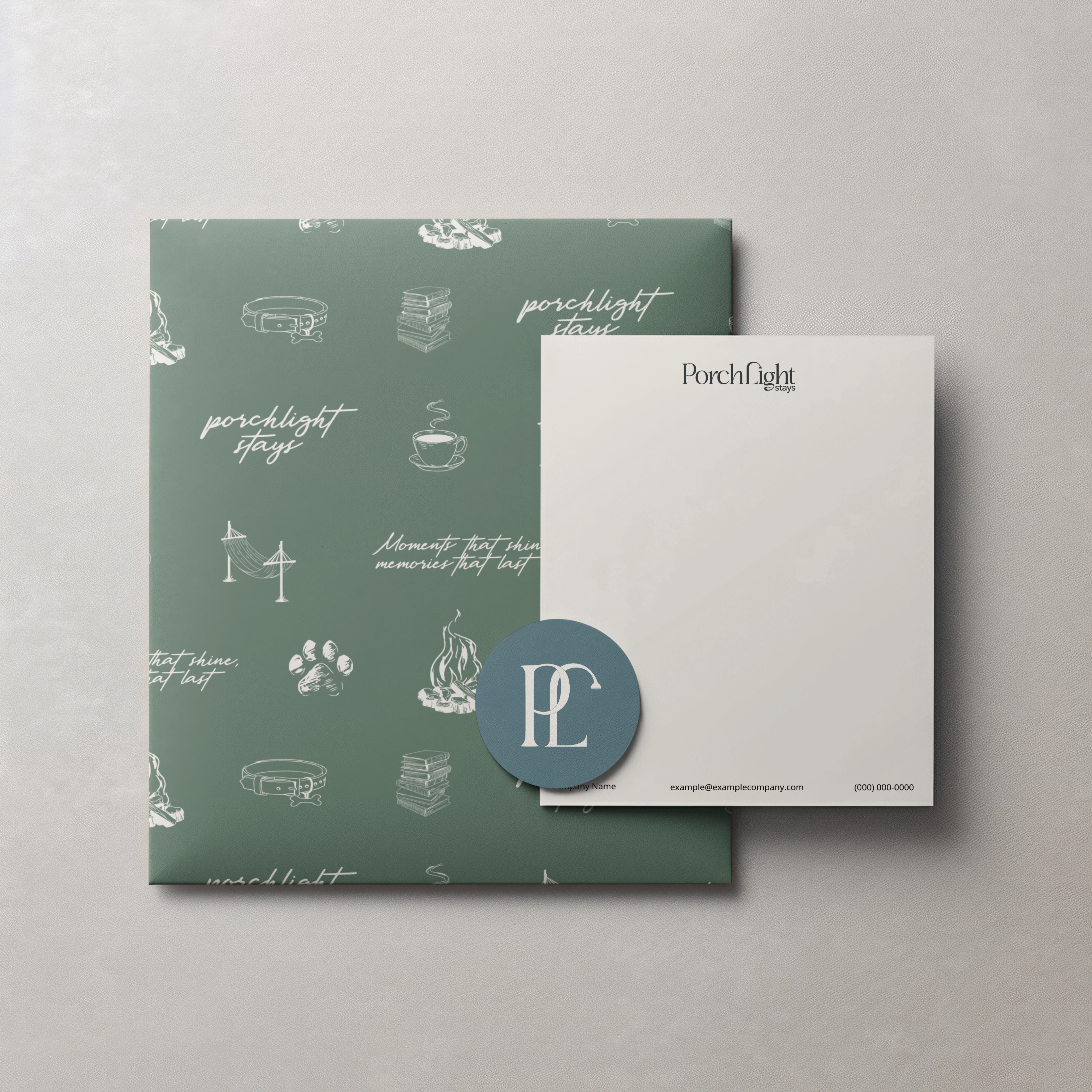
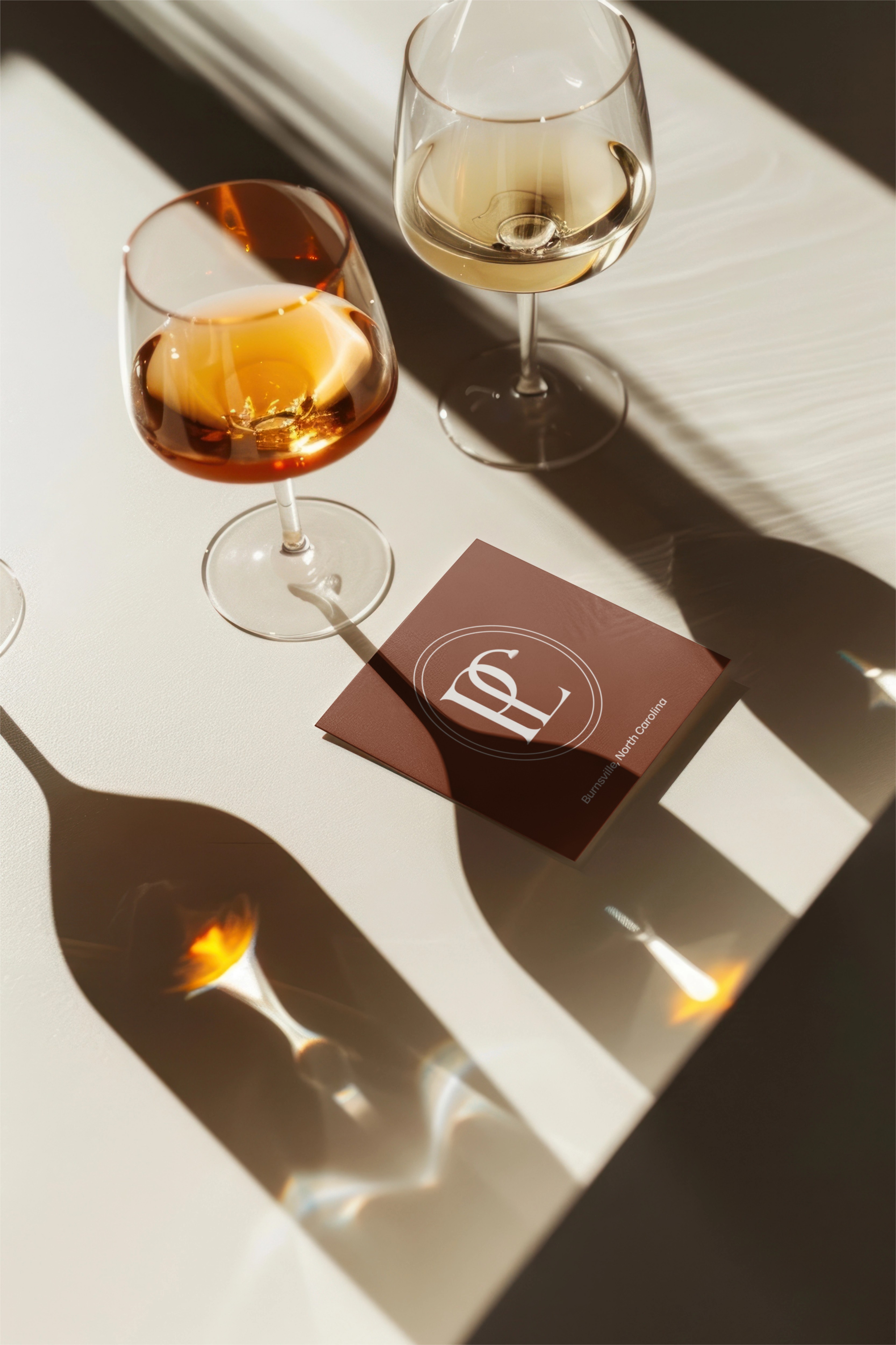
We built a calming, nature-rooted palette to work seamlessly across both beach and mountain properties—soft neutrals, earthy greens, and warm accent tones that evoke comfort without feeling theme-y. Typography pairings strike a balance between timelessness and clarity, with elevated type hierarchy designed for both print and digital use.
Custom icons and supporting brand marks introduce flexibility while maintaining consistency. From property signage to social graphics to future merch applications, the system was designed to grow with the brand—distinctive enough to stand out, yet familiar enough to feel like home.


Thank you
Have an idea?
We'd love to hear from you!