The Iceberg Tahoe
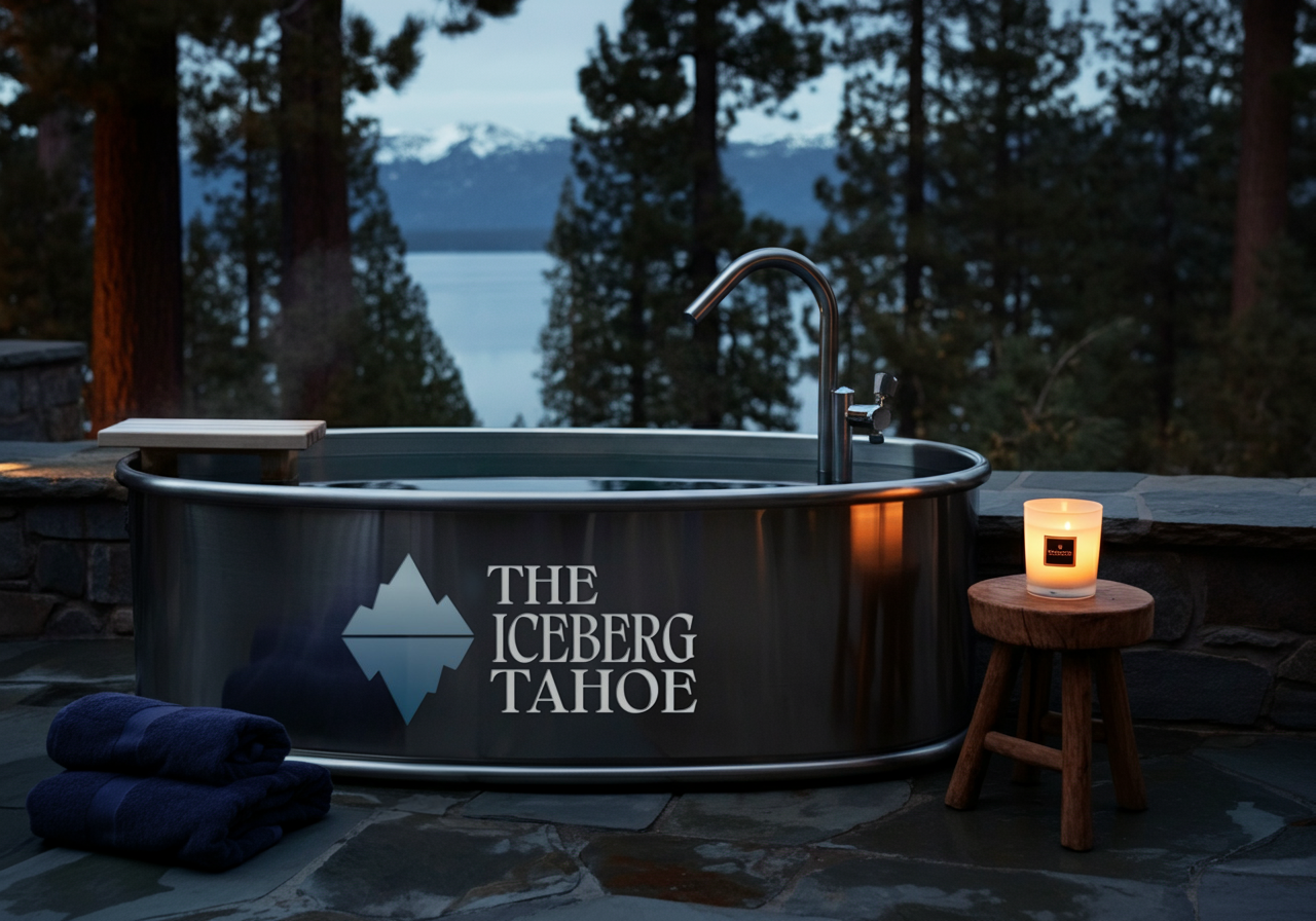
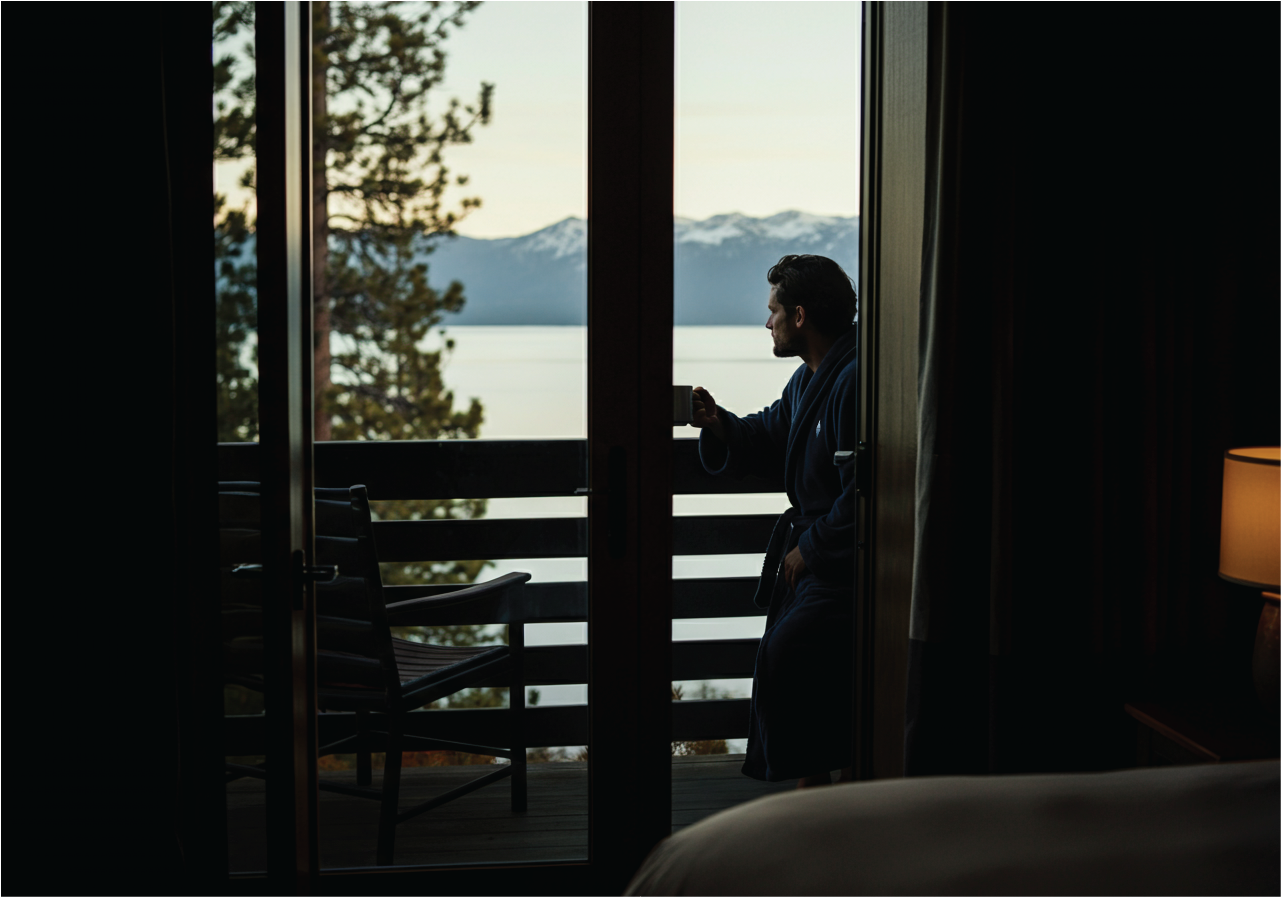
The Iceberg Tahoe is a transformed 19-room boutique hotel in South Lake Tahoe. Revitalized from the previous Avalon Lodge, under new ownership it’s now positioned as a design-forward, experience-rich retreat for couples and modern travelers seeking connection, calm, and immersion in nature. We crafted the full visual identity to reflect that elevated vision.
Overview
A Brand With Depth
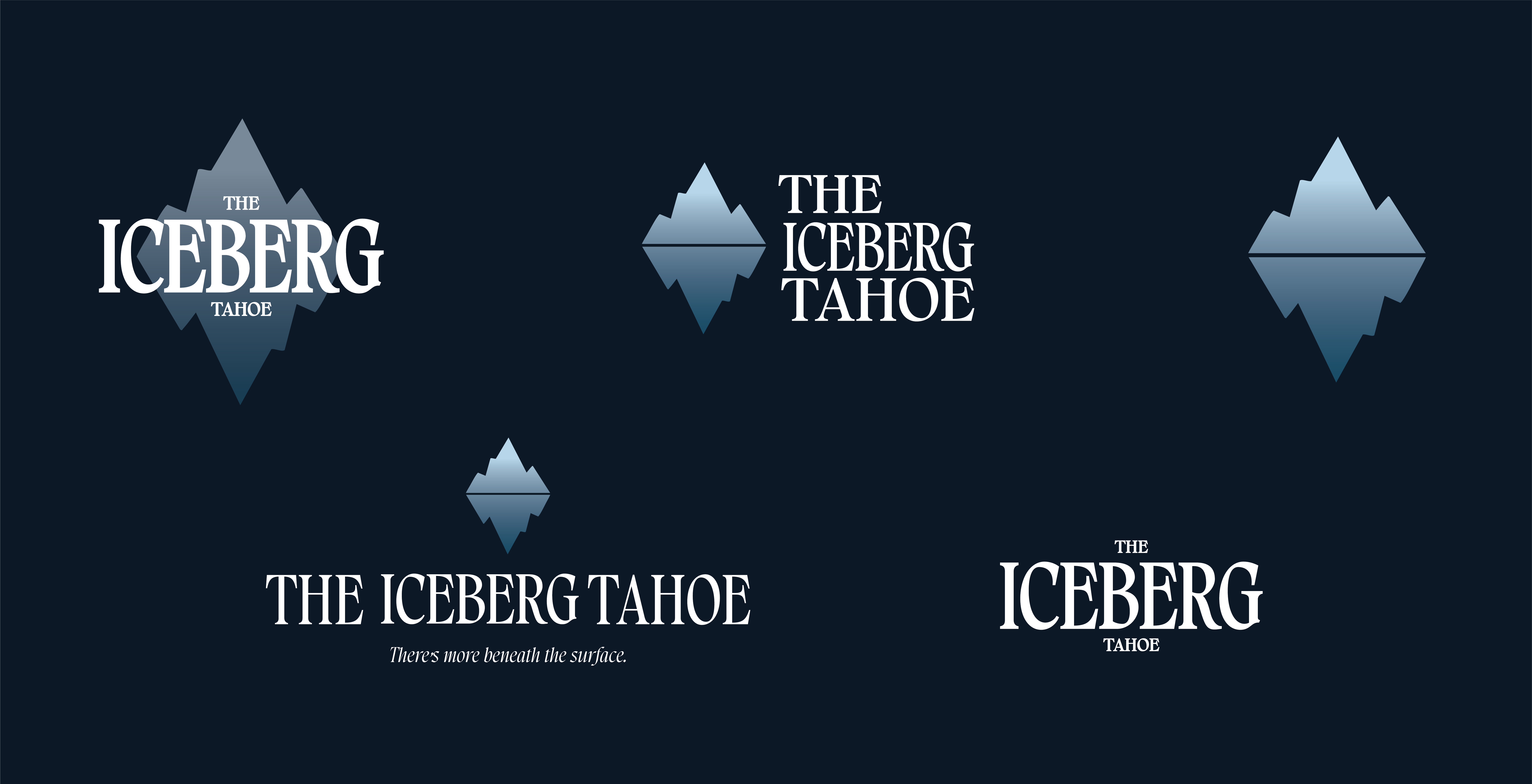
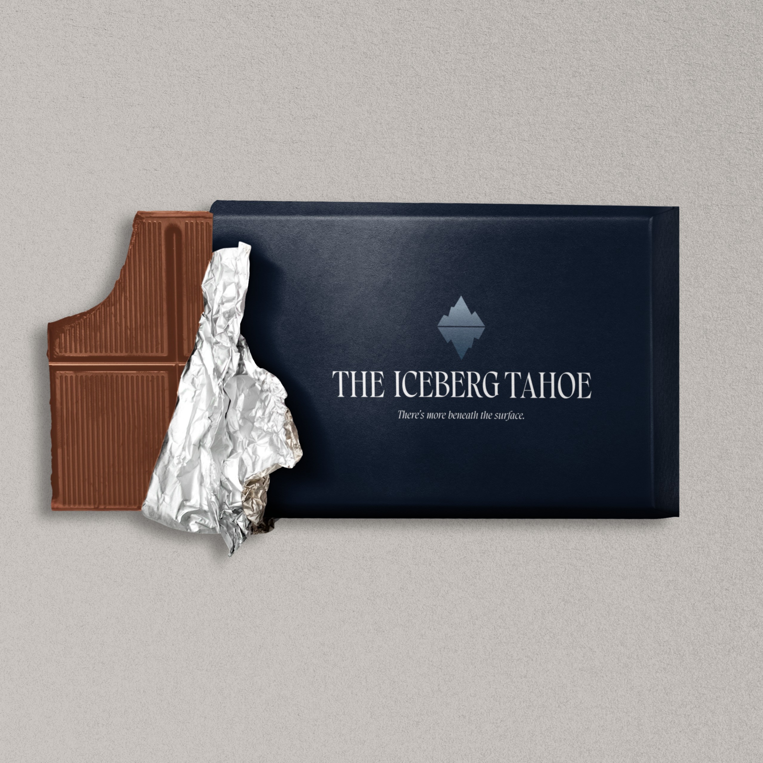
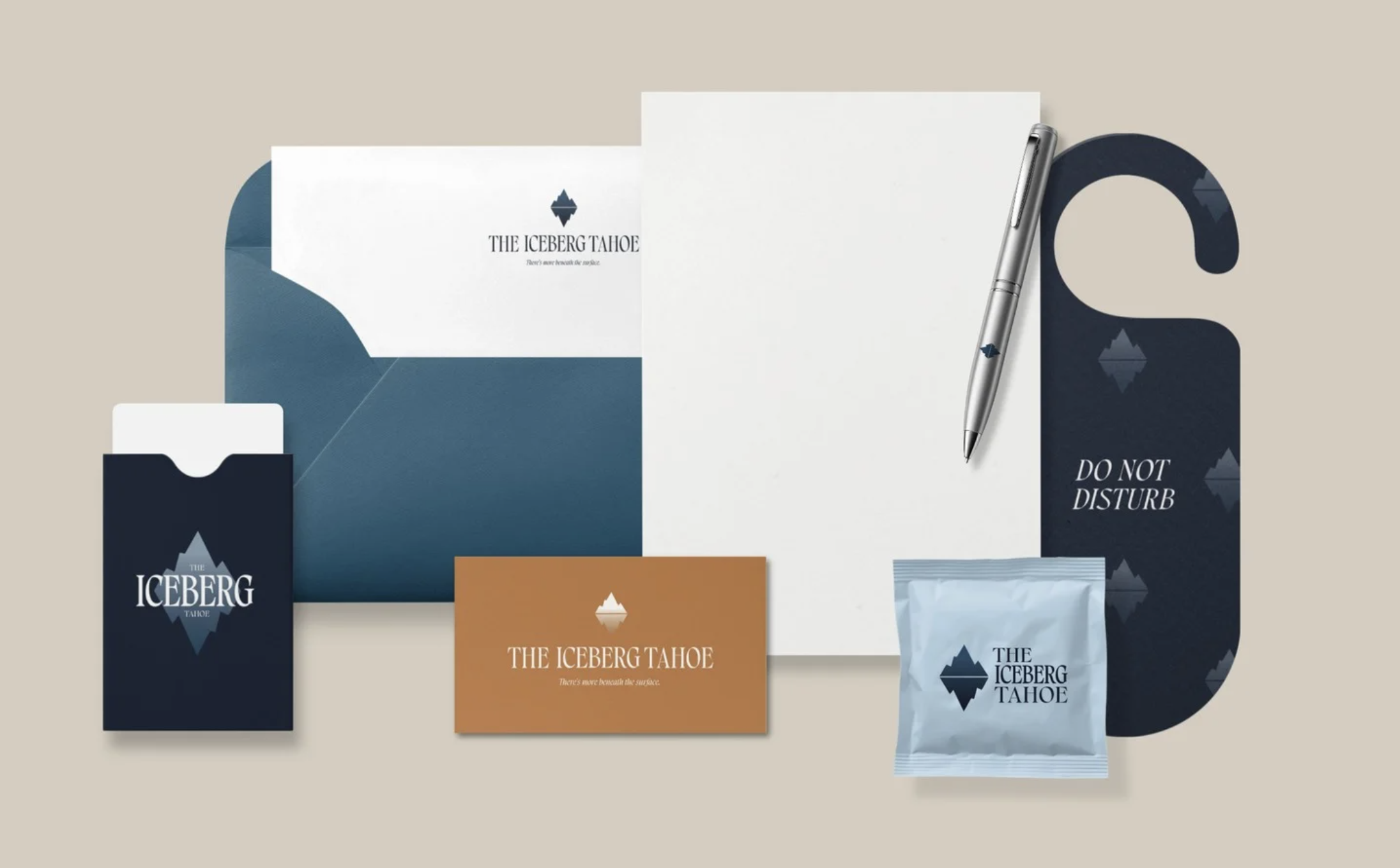
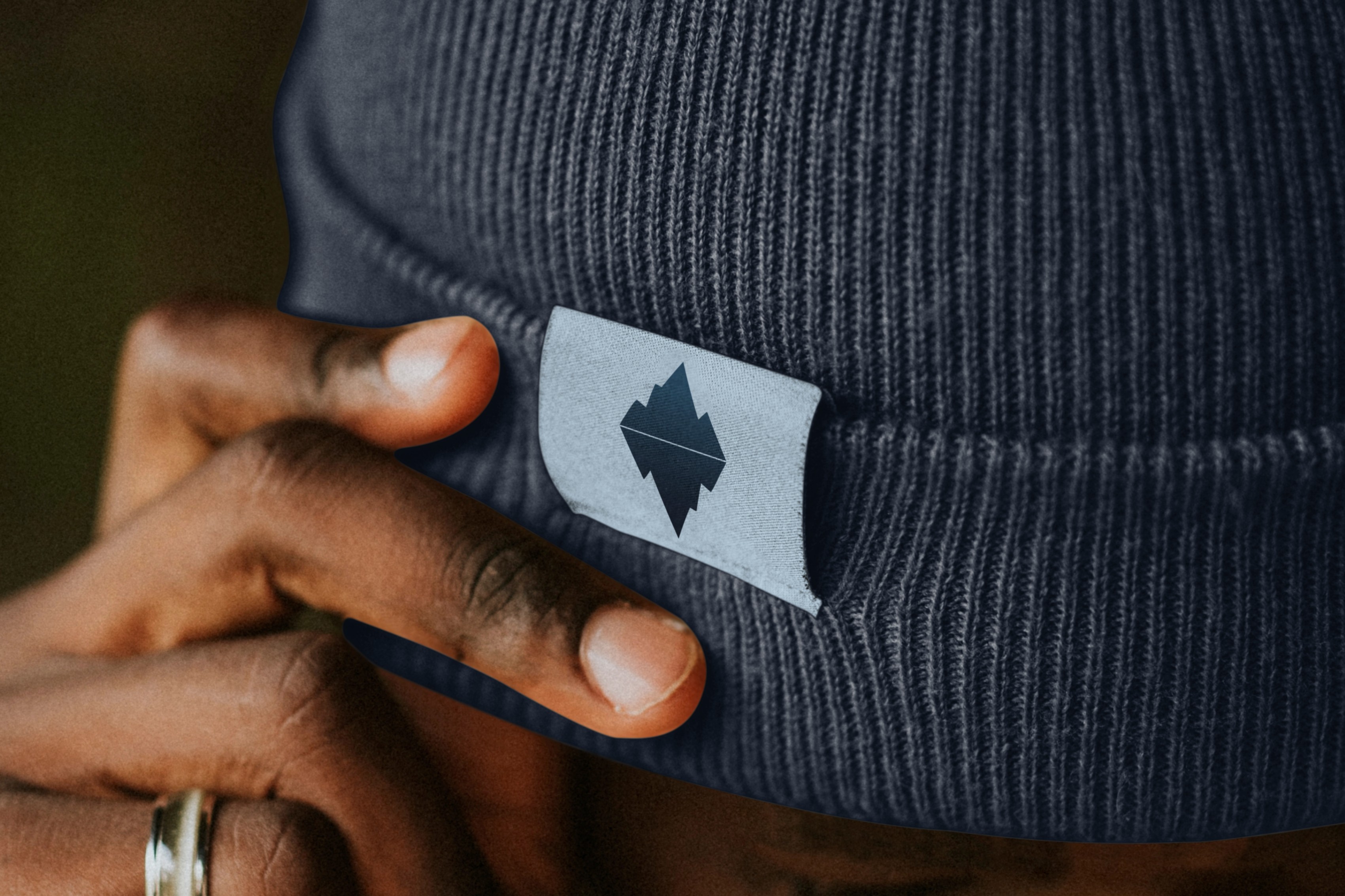
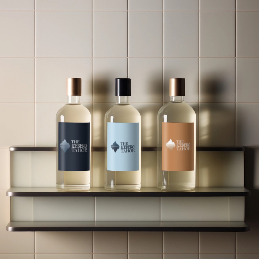
The Iceberg Tahoe concept centers on the idea that both the natural world and human experience have layers beneath the surface. The rebrand captures this duality through a minimalist iceberg symbol—serene above the waterline, bold geometric shape below—and the tagline “There’s more beneath the surface.”
We paired a refined serif wordmark with a cool, cinematic palette—deep navy, slate blue, and soft sky tones balanced by warm neutrals and crisp white. The result is a visual system that feels both grounded and elevated. Flexible logo lockups—stacked, horizontal, and icon-only—ensure seamless use across print, digital, and environmental applications.


Thank you
Have an idea?
We'd love to hear from you!