Woodbound
Woodbound is a reimagined New England lakeside retreat—once a beloved local landmark, now thoughtfully restored into a place where guests feel instantly welcomed and deeply connected. Designed to honor heritage while embracing modern comfort, Woodbound invites families, couples, and locals alike to slow down, gather, and return year after year. We partnered to create a brand that feels timeless, warm, and full of life—across every season.
Overview
A Visual Identity Rooted in Place
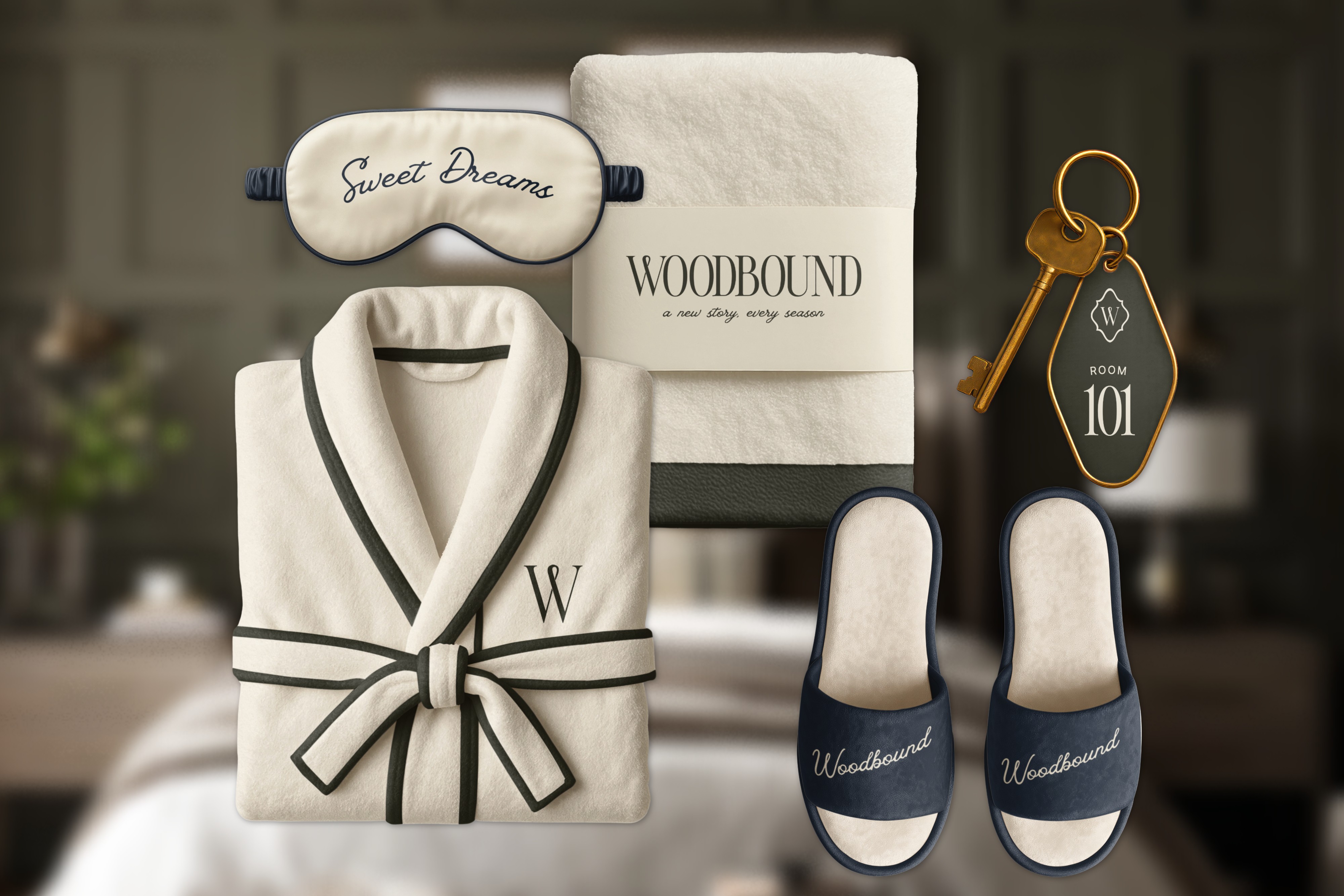
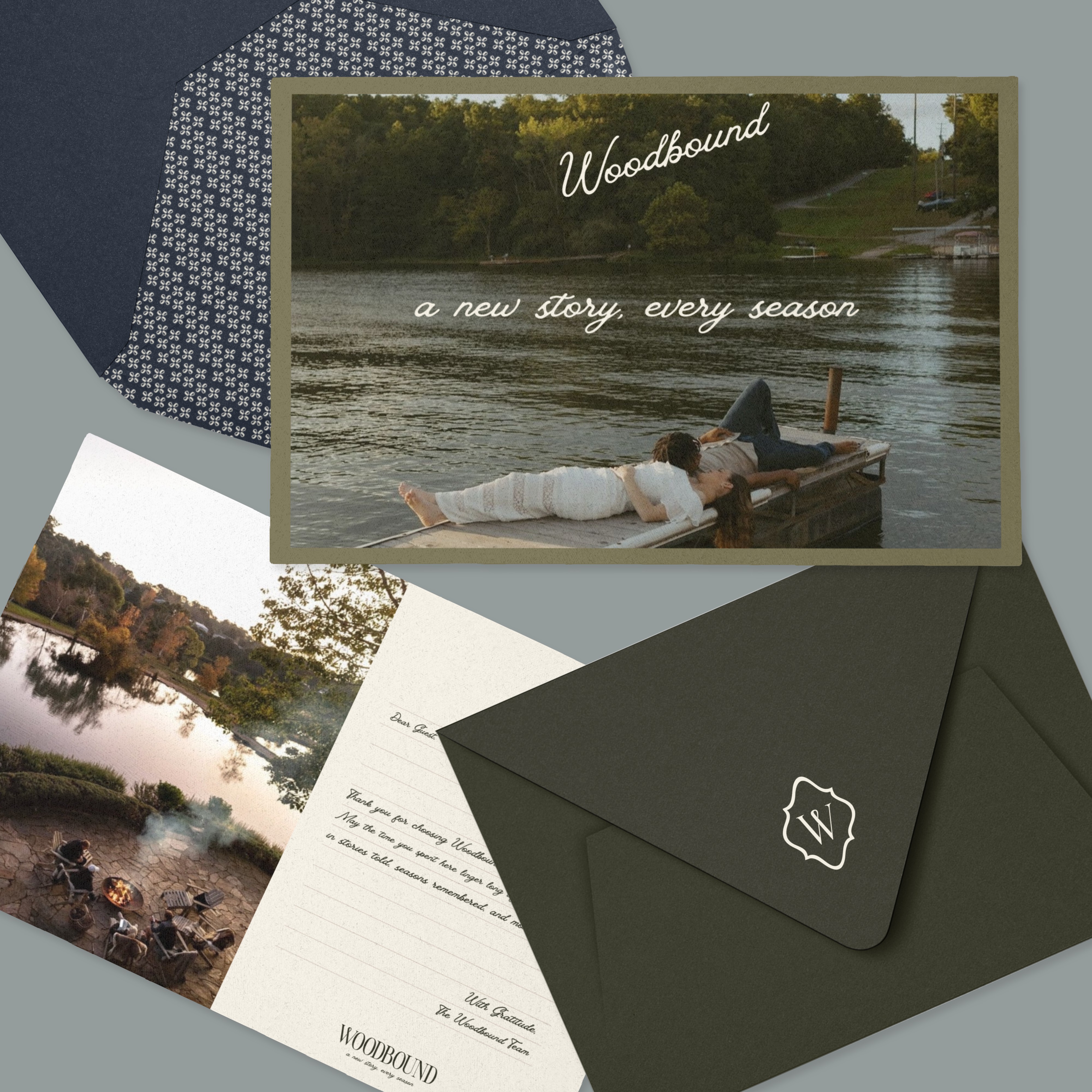
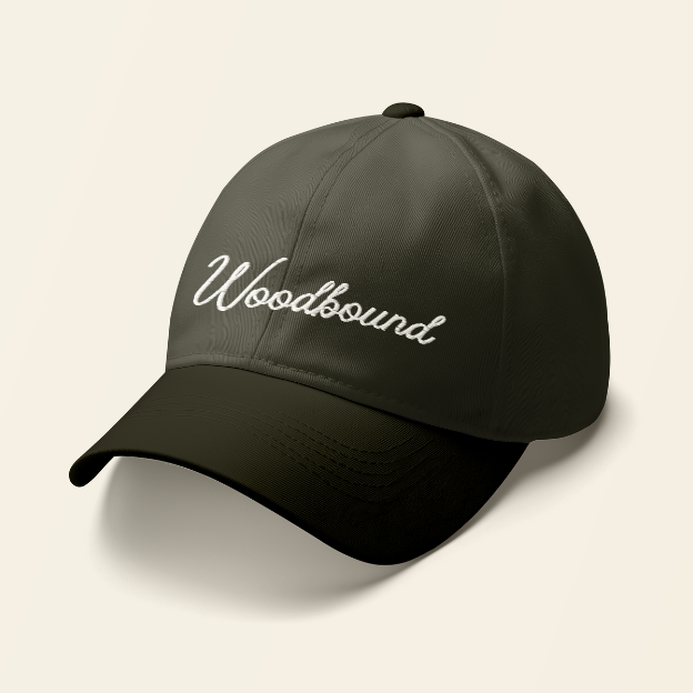
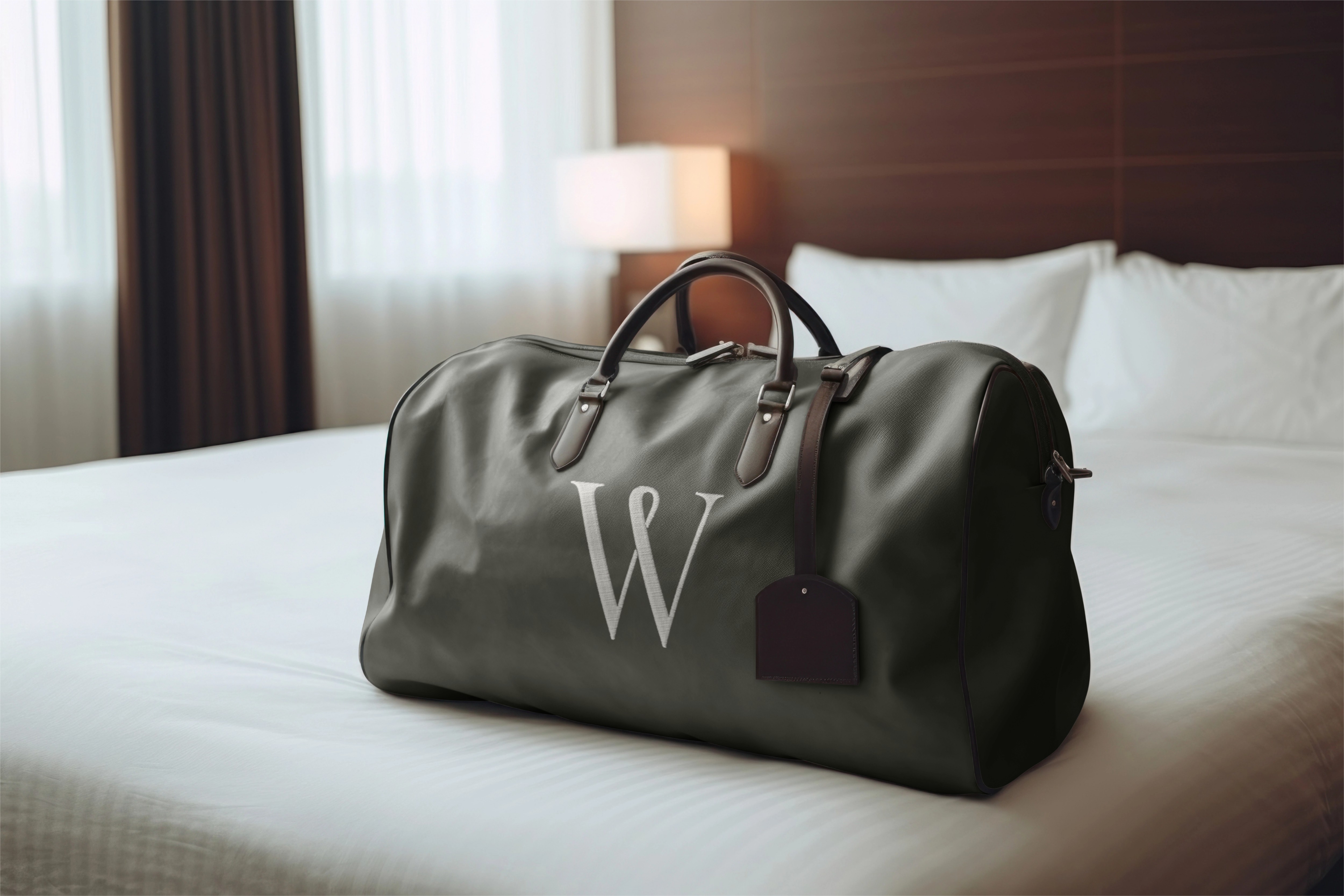
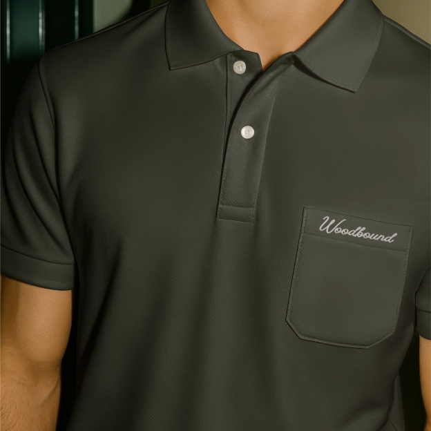
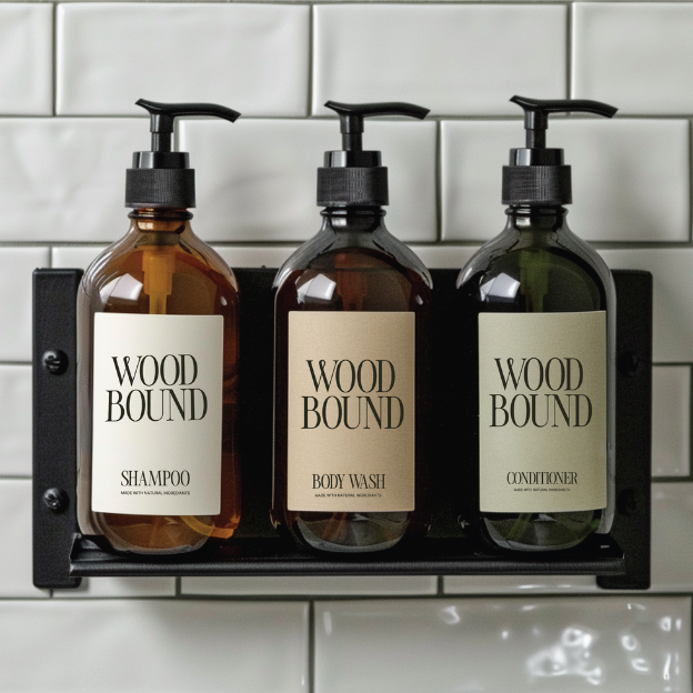
The Woodbound visual identity draws from classic New England architecture, lakeside living, and slow, seasonal rhythms. We developed a timeless logo suite supported by a calm, grounded color palette inspired by nature—deep greens, soft neutrals, muted blues, and warm creams—paired with editorial typography that feels both refined and approachable.
Flexible logo lockups, subtle patterns, and supporting brand elements allow the identity to live seamlessly across signage, print, digital, and on-property applications. Every visual decision was made to reinforce a sense of ease, warmth, and belonging—creating consistency without feeling rigid or overdesigned.
The result is a visual system that supports the guest experience quietly and confidently, allowing the setting, stories, and moments at Woodbound to take center stage.


Thank you
Have an idea?
We'd love to hear from you!